Principle of Contrast in Art (What It Is & How To Use It)
There are so many elements to excellent artworks that learning about them all can be overwhelming. Some of the most crucial elements in art are collectively known as the principles of art. Since contrast is one of the most important principles of art, you may ask: what is a contrast in art?
Contrast refers to the art principle achieved by bringing opposite elements together. Proficiency in creating perfect contrasts between elements in your artwork is an invaluable skill for any artist and is an indispensable tool for telling stories with your art.
With many artists describing contrast as “everything in art,” you don’t want to be lacking in your knowledge of contrast. In this post, you’ll learn everything you need to know about the contrast in art and how to use it to create more outstanding designs.
What Is Contrast in Art?
(This article may contain affiliate links and I may earn a commission if you make a purchase)
Contrast refers to the artistic element achieved when two opposing elements come together. It breathes life into art and directs viewers’ attention to specific areas of the artwork.
Putting two contrasting things together to produce a piece that’s pleasing to the sight is an invaluable skill for artists. The ability to use the different kinds of contrast to bring attention to specific areas of an artwork is what separates good artists from great ones.
Apart from bringing attention to certain parts of your artwork, there are many other uses for contrast in art. This article will extensively analyze the different types of contrast in art and how you can use them to create masterpieces.
Types of Contrast in Art
When you think of contrast in art, you immediately think of contrasting colors. While that is a type of contrast, it certainly isn’t all there is to contrast in art and design.
Here are some of the most common types of contrast in design and how they can drastically change a dull and unconvincing artwork to an excellent masterpiece.
1. Color Contrast
When learning about the contrast in art, color contrast is most likely the first type of contrast you’ll be introduced to. It’s easy to imagine, but it’s not as easy as you think unless you have some background knowledge about color contrast.
Color contrast can be further subdivided into three types: hue, saturation, and value contrasts. Understanding how these three subtypes contribute to the color contrast of your artwork is essential to fully grasp how color contrast works in art.
- Hue contrast
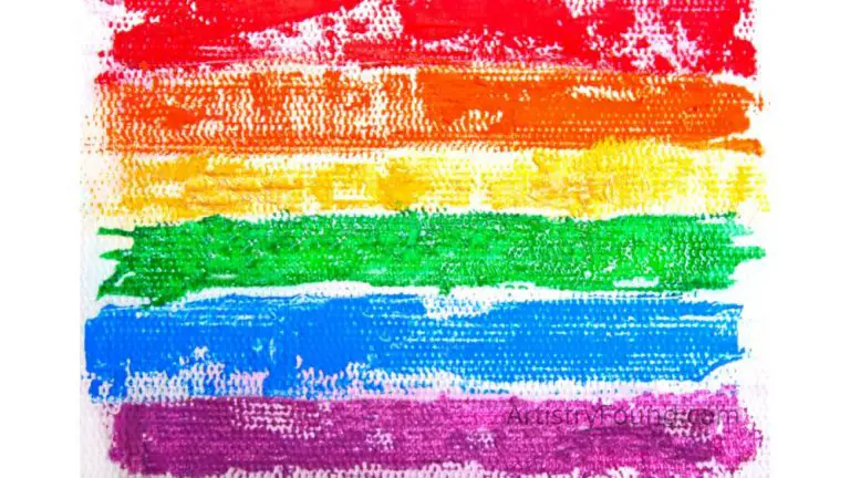
Hue refers to colors in their most basic form as they appear on the color wheel. When you think of the contrast between yellow and green, you’re thinking purely in terms of hue contrast, which is the most basic concept of color contrast.
On the color wheel, colors on opposite sides are contrasting, and using opposing colors without regard for their intensity or saturation is the use of “pure” hue contrast. True mastery of color contrast is when you can effectively combine hue contrast with the other color contrast types.
- Saturation contrast
The saturation of the colors you use across your artwork plays a crucial role in making it less plain and more true to life.
Putting contrasting dull colors against saturated ones creates the best color contrasts. You can reduce or increase the intensity of your color contrast by simply increasing or decreasing the saturation of the contrasting colors.
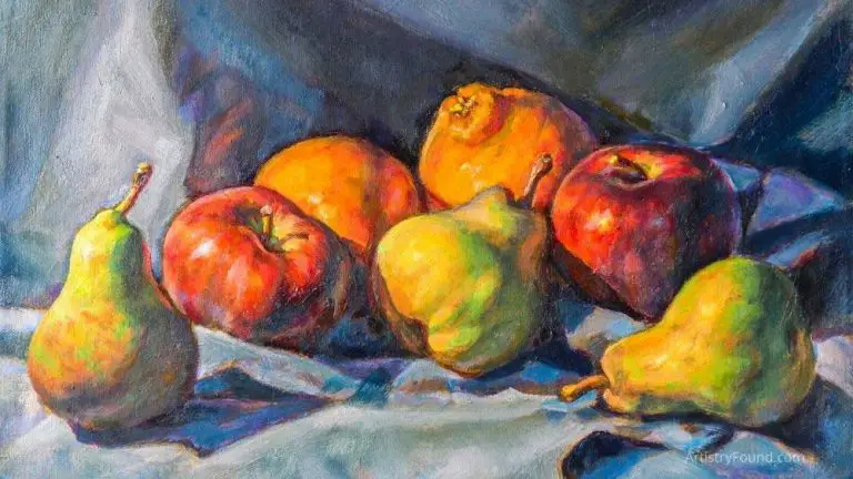
More intense colors stand out better against dull colors, bringing a viewer’s attention to the most saturated part of your image. When saturation is used effectively with hue and value, it can hide or highlight specific design parts for heightened or reduced attention.
- Value contrast
Many artists believe the value to be the most important aspect of color in terms of contrast. Value refers to the lightness or darkness of a color. Our eyes are more sensitive to the value of color than its saturation.
Many artists get confused by the idea of color value and how it differs from saturation. Value and saturation may appear to be very similar, but they’re very different.
The value of a color refers to how much light reflects from it. The more light a color reflects, the lighter it is. Saturation, on the other hand, measures the vibrancy or intensity of a color. The higher the saturation, the more intense it appears.
2. Shape Contrast
Apart from color, an artist can also create contrast between the shapes in a piece of artwork. This type of contrast is referred to as shape contrast, which you can use to guide an observer to the main parts of the design.
The first step to mastering shape contrasts is breaking down your entire artwork into basic shapes. Giving the focus of the design a unique shape will make it stand out while making the overall work look less bland.
3. Detail Contrast
The idea of detail contrast is simple, but it takes constant practice and experience to get it right.
Giving your entire artwork the same level of detail won’t only make it uninteresting, it will also confuse viewers, as there isn’t specific focus in any part of the artwork.
To draw attention to specific parts of your artwork using detail contrast, make some of the parts of the design more detailed than the others. Naturally, viewers will gravitate towards the elements of the design with the most detail.
Importance of Contrast in Art
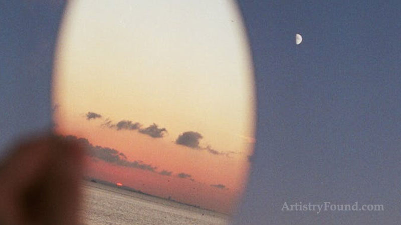
Learning about the different types of contrast will be useless if you don’t know the significance of creating contrast in your designs.
When used correctly, contrasts can help draw attention to certain parts of an artwork. For example, detail contrast can bring your attention to the most detailed elements of a design, and color contrast can help highlight contrasting colors to isolate the subject of the artwork.
Creating contrast in your artwork also makes it more interesting to view. A design with the same color saturation, lines thickness, and recurring shapes will look bland.
You can make contrast work for you, depending on your specific artwork. If you have one of the main elements of the design that looks out of focus, you can reinforce its color to draw attention to the design element.
Knowing how to combine opposite visual elements of a design to create a guiding, aesthetically pleasing artwork is your first step to graduating from a good artist to a great one.
How to Use Contrast in Art
A book differs from an artwork in the sense that a book has a predefined guide. Everyone starts reading from the first chapter to the last chapter in chronological order.
In a piece of artwork, there are typically no guides. You must use contrasts to guide the viewers through interesting elements in the design and highlight what you want them to see first.
You also use contrast to differentiate from the foreground and background of a design while ensuring that the less dominant parts of the artwork don’t get ignored.
Becoming proficient in using contrasts will instantly show in the quality of your artwork, but there is no perfection in art. With continuous usage, experimentation, and practice, you can become increasingly better at using opposites to prove your points in a design.
More From Artistry Found
- What is Proportion in Art? (Explained)
- Composition in Art: What’s its Common Purpose?
- Which Colors Are Used Most in Art? (You May Be Surprised!)
- In Art, What is Tint, Shade & Tone? (Variables That Affect Color)
- Do Artists Have A Responsibility To Society? (The Truth)
References:
