Which Colors Are Used Most in Art? (You May Be Surprised!)
Artists use a wide range of colors in their work. But just which colors get used the most becomes very obvious when comparing the color schemes of over 120,000 paintings. So which colors are used most in art?
Warm colors such as red, yellow and orange are the most used colors in the art world. That being said, there has been a large increase in the use of the color blue over the last 200 years.
According to a recent study (more on that below), the color blue has become more popular over time. This change may present a shift in how artists and the general public perceive color in art.
(This article may contain affiliate links and I may earn a commission if you make a purchase)
The Difference Between Warm and Cold Colors in Art
Red and yellow are both primary colors, and all the similar variations of these colors, like orange, are categorized as warm colors. On the other side of the color spectrum are the cold colors. Blue is the only primary color in this category, but green, purple, and variations of these are seen as cold colors as well.
What’s interesting, however, is that colors in these categories can take on other temperatures depending on their relationship to a neighboring color. In other words, one shade of red can seem cooler than another shade of red, particularly when used side-by-side in a painting or other artwork.
The color combination used in a painting, illustration, or other artwork help us determine how the objects in the piece are positioned when compared to the rest of the scene. This is used to show if an object in a scene is closer or further away from us in terms of perspective. Warmer colors often appear closer to us and colder colors are more distant.
The colors used in art also affect us psychologically. Warm colors can bring feelings of energy or aggressiveness, while cool colors tend to invoke calm, introspective emotions or even sadness. However, the meaning and feelings associated with different colors vary between cultures and individuals. We all have different favorite colors, right?
Color in Art: Trending From Orange to Blue
Martin Bellander, a research affiliate at the Swedish Karolinska Institute, completed a study comparing the trend of colors in over 120,000 paintings between the years 1250 and 2010.
He gathered pictures of oil, acrylic, tempera, and other/mixed paintings downloaded from the BBC, Google Art Project, Wikiart, and Wikimedia commons. Choosing a random 100-pixel spot from each painting he then compared the color results in a diagram.
The color chart below shows that orange has been the dominant color in these paintings throughout history, but to our surprise, we can see a new trend of cool color with the increased use of blue in paintings throughout the 20th century.
Check out my blog post about how to visualize the colors of paintings over time! #datavizhttp://t.co/kw39ZmKVAd pic.twitter.com/bVMSifyMve
— Martin Bellander (@m_bellander) April 4, 2015
He also found that the color blue has been used much more often in acrylic paintings than in oil paintings in the last 200 years. In addition, the color graph shows that blue isn’t the only hue that has increased in use. In fact, all the predominant colors are being used more often with the exception of orange. It’s interesting that the color orange (the most used color in art history) seems to be on the decline.
There are various potential explanations for this trend. The first is that the color blue is a relatively new color, historically speaking, in the art world. Warm colors have been used in art for far longer than cooler colors.
Blue was first used by the Egyptians around 3,100 B.C. while red was used by cave people as far back as 10,000 B.C. But is this fact alone enough to explain the predominate use of orange, red and other warm colors in art throughout history?
The explanation could also be that blue was a more difficult color to create and was therefore more expensive. Perhaps a decrease in price, and an increase in accessibility over time has caused the colour blue to gain in popularity? If blue paint has become cheaper and easier to make it could explain its increase in use.
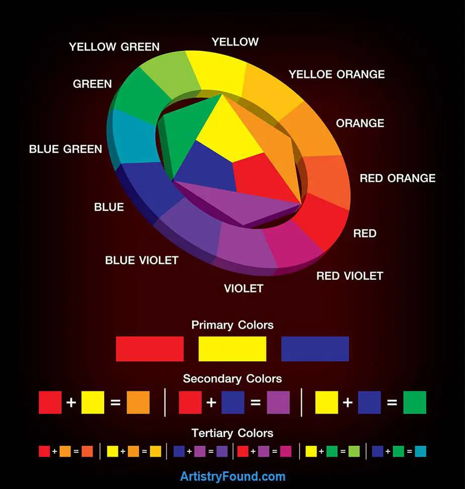
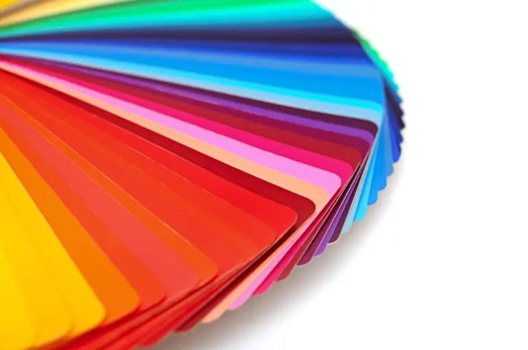
A color wheel showing the primary, secondary, and tertiary colors.
- Primary colors – These are the main building blocks of color. The colors that all the other colors can be made from when mixed.
- Secondary colors – A secondary color is one that can be obtained by mixing two primary colors together.
- Tertiary colors – A tertiary color is achieved by mixing one of the primary colors with a secondary color that is next to it on a color wheel (Canva).
- Complementary Colors – A color that is directly opposite another color on the color wheel is said to be its complementary color. (Green and Red are complementary colors on the wheel because they are the hue opposite from each other)
Another explanation could be that dark colors such as black could have been registered as blue by the camera. That would mean that the blue trend actually is more of a dark trend in colors, or that there has been more black used in paintings in the last century. Also, it’s important to note that the quality of the photos or scans of the paintings could have caused a shift in the actual colors, making the tones appear different on a computer screen.
It is also a fact that the colors used in paintings have a tendency to change over time. Oil paint becomes more yellow with time, while acrylic paint does not. This is all due to the aging of resins which are made from organic or synthetic substances. So it’s possible that how the colors looked hundreds of years ago is not fully representative of how they look today. I think it’s safe to assume that historic paintings are more yellow today than when originally painted.
But this result of seeing a trend in use to cooler colors, and blue in particular, is still really exciting! There has not been a change for such a long time, and then just in the last century artists have chosen to use more blue in their paintings. So even with it potential flaws, the study shows without a doubt that color use and preference in the art world is changing.
The Importance of Color in Art
Color in art is important because the color palette of an artwork sets the mood and helps guide a viewers emotional response. Colors generally correspond to different emotions, and indicate whether the intention of the art piece is to invoke peace, anger, romance, happiness, relaxation, etc.
Color in art allows the artist to express themselves and bring their emotions to life. An artist can use color for decorative beauty, to create a mood, or to evoke emotions.
The choice of color scheme varies depending on what type of art you want to create. The colour palette used in a painting or art piece may determine if the art is supposed to be representative of nature or entirely abstract.
Henri Matisse (1869-1954) is a great example of using color in line with feelings and breaking patterns. Matisse once said:
“When I put down green it doesn’t mean grass, and when I put down blue it doesn’t mean sky.”
Henri Matisse
Even though colors bring different emotions depending on the individual, there has been generally assigned emotions and meaning to different colors.
- Blue is calming, cool and symbolizes the sky, water, intelligence, stability, and trustworthiness. Because of these qualities a lot of tech companies have chosen blue in their logos and web design to increase brand recognition. (The rise in advertising and marketing might also be a reason that art colors are trending towards blue.)
- Purple symbolizes royalty, luxury, and power. It brings feelings of peace, mystery, and wealth.
- Green is symbolic of nature, good luck, health, and jealousy. It can bring a feeling of peace, safety, or envy.
- Yellow represents optimism, inspiration, happiness, and summer. However, it is used a lot when expressing a warning too.
- Red, an emotionally intense pigment, symbolizes danger, love, passion and brings feelings of romance or anger.
- Orange is enthusiastic, happy, and spontaneous. It symbolizes adventure, fall, citrus, and warmth, but can also be overpowering.
Which Colors Are The Least Used in Art?
It is hard to say which colors get used the least in the art world. There have not been any specific studies on that particular topic, but looking at the color graph (near the top of the article) I would say that it would be purple or yellow.
Yellow is only preferred by five percent of people as their favorite color according to a survey by Dulux Paints. But I do not think that is the reason why it is not used in paintings that often. Think about it, how much yellow can you see when you look out your window? Maybe we just do not see that much yellow in our everyday life so we tend to forget the color as artists too.
I have the same theory about purple. However, looking at different surveys, research, and diagrams, purple is actually more popular than yellow.
Interestingly, however, both yellow and purple are more popular as a favorite color than orange for most people! So, I guess that goes to show that a persons favorite colors has nothing to do with how common the color is in art.
Color Theory: Use a color wheel and color harmony to select complimentary colors.
Conclusion
The warm colors of orange and red have been the most prevalent colors used in art for thousands of years. But shades of blue in the art world have become an increasingly popular trend in the last 200 years. I think we will just have to wait and see what the future brings.
It really comes down to the individual artist’s personal reasons for choosing one color over another. We cannot say that paintings are becoming more sad and depressing just because of the increasing use of blue. Neither can we say that all paintings using orange have been enthusiastic and happy. The choice of color is personal and an artist’s best tool for expression.
More From Artistry Found:
- Artists vs Scientists (Similarities & Differences)
- How Artists See The World (A Different Vision)
- Can I Be an Artist If I Can’t Draw? (Art Without Drawing)
Sources:
Wikipedia – Color wheel
UAF – Color design theory
True Value – Color psychology
