The Power of Color: Unveiling Artist Secrets to Emotional Alchemy
Color theory is an essential tool for artists. It serves as a roadmap to crafting visual experiences that can stir emotions within you.
Understanding the relationship between colors allows artists to convey a broad spectrum of feelings through their artwork. For example, cool blues can evoke peacefulness, while fiery red can radiate energy. This intricacy of color interactions is what enables artists to create pieces that resonate on a deeply emotional level. They connect with viewers on an instinctive and visceral basis.
(This article may contain affiliate links and I may earn a commission if you make a purchase)
The power of color in art extends far beyond aesthetic appeal. It is a language of its own that speaks directly to your emotional response.
Just as musicians use notes and chords to create an emotional narrative in music, artists use color to compose moods and convey messages within the visual space.
Warm colors often evoke feelings of happiness and energy, while cool tones can instill a sense of calm or sadness. These emotional responses are no accident. They are the result of the careful application of color theory principles, refined through centuries of artistic tradition and scientific study.
Key Takeaways
- Color theory guides artists in using color to evoke specific emotions in the viewer.
- Artwork communicates with us on emotional levels through the psychological impact of colors.
- A deeper understanding of color can enhance the emotional depth and harmony within a composition.
The Basics of Color Theory
Dive into the world of colors and understand how they work together to create a visual splendor that stirs emotions.
You’ll discover how the color wheel forms the foundation of color theory. You’ll also learn how primary, secondary, and tertiary hues interact to expand the artist’s palette.
Understanding The Color Wheel
The color wheel is a simplified representation of colors and their relationships. As an artist, imagine it as your guide for mixing colors and crafting harmonious designs.
The wheel helps you see the sequence of colors and how they transition into one another, providing insights into creating balance and contrast in your artwork.
- Hue represents the pure pigment without tint or shade. Think of it as the root of color theory.
- Saturation speaks to the intensity and purity of a color. Highly saturated hues are vivid, while desaturated colors appear more muted.
- Brightness, or value, indicates how light or dark a color is without considering its hue.
Primary, Secondary, and Tertiary Colors
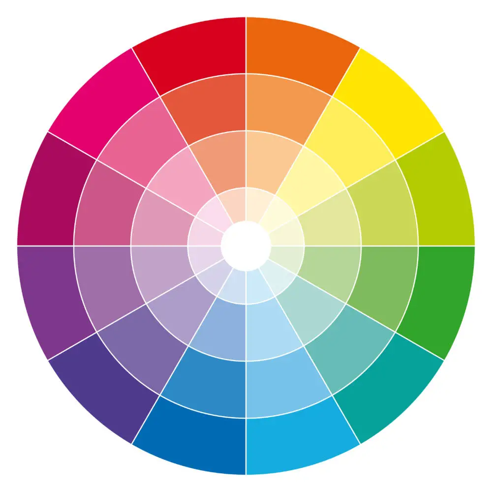
In the realm of color theory, primary colors are the big players. These colors—red, blue, and yellow—are the essence because they cannot be made by mixing other colors.
Secondary colors—orange, green, and violet—are the dynamic offspring of primary colors. They’re created when you mix two primary colors in equal parts. It’s like a color recipe; red and yellow make orange, blue and yellow make green, and blue and red make violet.
Moving a step further, tertiary colors are the result of mixing a primary color with a neighboring secondary color. This fusion gives rise to six more complex colors, namely:
- Red-orange
- Yellow-orange
- Yellow-green
- Blue-green
- Blue-violet
- Red-violet
These tertiary colors expand your palette dramatically, giving you the tools to evoke the precise mood you’re aiming for in your artwork.
The Psychological Impact of Color
Colors are much more than a visual treat; they are a language of emotions that you instinctively understand. Dive into how hues can sway your mood, symbolize cultural concepts, and whisper to your emotions without a single word.
Emotions and Mood
Warm Colors: Imagine being wrapped in a cozy red blanket; this color often embodies energy and passion.
Artists use warm colors to create a sense of coziness or to ignite an emotional response that can range from comfort to urgency.
- Red: Often signifies love and desire.
- Orange: Can instigate feelings of vitality and enthusiasm.
- Yellow: Tends to inject optimism, resembling the brightness of the sun.
Cool Colors: Conversely, cool colors like blue and green can usher you into a state of calmness and tranquility.
- Blue: Consider the serene blues of Monet’s Water Lilies, which can evoke peace and calm.
- Green: Often associated with nature, encouraging a sense of renewal and rest.
Cultural Significance of Colors
Colors don’t just elicit emotions; they carry deep cultural and symbolic meanings that resonate with you on a different level.
- White: In many Western cultures, it symbolizes purity and innocence, while in some Eastern cultures, it’s associated with mourning.
- Black: Frequently represents sophistication in fashion, yet it can also signify mourning or solemnity.
Color Schemes and Harmony

Dive into the world of color, where harmony is key, and every shade can evoke a different layer of emotion. Mastering color schemes helps you tap into this power effectively.
Complementary and Analogous Colors
Complementary Colors are directly opposite each other on the color wheel. They create a stark contrast, making each color appear more vibrant when placed side by side.
When you use complementary colors, like red and green or blue and orange, you achieve a sense of balance and high contrast. This grabs attention and stimulates the viewer.
Analogous Colors, on the other hand, are next to each other on the color wheel. These colors, like red, orange, and yellow, harmonize beautifully and create a serene, comfortable design.
They offer less contrast and a more cohesive feel to your work, promoting unity and a sense of tranquility.
Triadic and Monochromatic Themes
Triadic Color Schemes involve three colors evenly spaced around the color wheel, like red, yellow, and blue.
This scheme promises a vibrant and stimulating visual experience, while still maintaining balance. Imagine the dynamic and bold feel it gives when used with the right harmony!
Monochromatic themes involve a single hue, with variations in lightness and saturation added. Such themes excel in creating unity and are excellent for evoking specific moods and feelings.
By adjusting the tint, tone, and shade of one color, you craft a cohesive and elegant look that is soothing to the eye.
Artists and Color

As you embark on a vibrant journey through art history, discover how master artists wielded the palette to stir emotions and communicate without words.
Influential Artists and Their Use of Color
Monet: Claude Monet, the father of Impressionism, frequently used color to capture the transient effects of light.
Monet’s series paintings, such as his haystacks or water lilies, illustrate how varied colors can represent the same scene at different times of day or seasons. This creates distinct emotions and atmospheres.
Rembrandt: In stark contrast, Rembrandt van Rijn’s use of color was more subdued. He utilized earthy tones that emphasized texture and depth, crafting dramatic lighting effects that draw your eyes to the focal points of his portraits and religious scenes.
Edvard Munch: Color in Edvard Munch’s “The Scream” goes beyond aesthetic to become symbolic. Its lurid oranges and blues viscerally convey angst and existential dread, proving color can serve as the subject’s own language.
Mark Rothko: With his large, luminous fields of color, Mark Rothko invites you into a meditative state.
He suggests that simplicity in color has its own complex language – one that speaks directly to your emotions.
Color to Convey a Message
Renoir and Da Vinci employed color to set moods and infuse their works with meaning.
Renoir’s rosy-hued brushstrokes impart a feeling of lighthearted jubilation, whereas Leonardo da Vinci’s subdued palette and precise color use in works like “The Last Supper” capture a specific narrative moment steeped in symbolic significance.
Techniques for Color Manipulation
To truly manipulate color, artists employ techniques such as:
- Glazing: Thin transparent layers of paint that modify the color and tone beneath, adding richness and depth.
- Juxtaposition: Placing contrasting colors side by side to intensify their visual impact and make elements pop.
- Analogous Colors: Using colors close to each other on the color wheel to create a harmonious and serene composition.
- Complementary Colors: Opposing colors on the wheel to create vibrant contrasts, often to guide the viewer’s eye to focal points or to enhance symbolism.
Colors and Emotional Responses
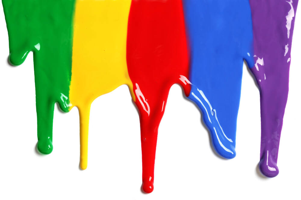
As an artist, you wield the power to evoke a range of emotions through the palette you choose. Each color harbors its own psychological undertone. These undertones can be amplified or nuanced in your artwork to stir specific feelings within your audience.
Warm Colors: Stimulating Excitement and Happiness
Red: Often symbolizing love and passion, red can also indicate danger or urgency. Its boldness tends to demand attention and can energize your viewers.
- Joy: A bright, cherry red can infuse a sense of playful joy.
Orange: This vibrant hue blends the fierce energy of red with the cheerfulness of yellow. Orange is your go-to color when aiming to express enthusiasm or inspire a sense of adventure.
- Excitement: A vivid orange can quicken the pulse and evoke a feeling of vibrancy.
Yellow: As the color of sunshine, yellow radiates optimism and happiness. It’s believed to inspire creative thoughts and positive energy. But be mindful—too bright of a yellow can sometimes provoke anxiety.
- Joy and Excitement: Lighter yellows can contribute to a cheerful atmosphere, suggesting lightness and spontaneity.
Cool Colors: Invoking Calmness and Serenity
Green: Echoing the hues of nature, green can generate feelings of calm and relaxation. It’s often utilized to indicate growth, safety, and stability.
- Calm and Relaxation: Soft greens can encourage a restorative, tranquil environment in your compositions.
Blue: Suggesting a serene sky or a tranquil sea, blue is the cornerstone of peace and trust in color psychology. It can help to lower stress levels and foster a sense of quietude.
- Calm, Trust, and Serenity: Using muted blues can help evoke feelings of calmness and trustworthiness.
Purple: Known as the color of royalty, purple can imbue a sense of luxury and mystery. Lighter shades, like lavender, are often associated with romance and nostalgia and can bring about a calming effect.
- Calm and Luxury: A soft purple can tranquilize and add an air of sophistication to your work.
The Impact of Color in Composition and Space

In the dynamic world of art, colors are not just mere shades; they are powerful tools to transform composition and define space. Let’s explore how a strategic splash of color can create depth, suggest movement, and highlight focal points in any artwork.
Depth, Movement, and Focal Points
When you glance at a painting, what draws your eye first? Artists often use color contrast and saturation to guide your attention to their intended focal point.
A saturated, warm hue like crimson can pull your eye forward, while cooler hues like deep blue recede, enhancing the sense of depth in a piece.
It’s all about creating an illusion. For instance, varying shades of a single color can give a sense of atmospheric depth, as if you could step right into the landscape.
Now, imagine a bird painted in bright yellow amidst a stormy, monochromatic sky — its stark contrast introduces a sense of movement, a visual narration of flight against the wind.
The Role of Color in Artistic Composition
Color in composition doesn’t just fill up space; it structures it. Think of color as the DNA of a painting, encoding spatial relationships and defining shapes.
- Warm Colors: Invigorate the composition, often making elements appear closer to you.
- Cool Colors: Provide a sense of tranquility, pushing elements to the background.
Artists wield colors like a magic wand to balance their compositions, by considering hue, value, and intensity:
- Hue: Determines the solid color found on the color wheel.
- Value: Refers to the lightness or darkness of a color.
- Intensity: Measures the brightness or dullness of a color.
The Theoretical and Practical Application of Color
In the fascinating world of art, understanding color theory isn’t just about knowing which colors look good together—it’s also about the science of perception and the hands-on methods that bring vibrant experiences to life on the canvas.
Experiments with Color and Light
Sir Isaac Newton’s experimentation with light and prisms revealed that color is a spectrum contained within white light. This foundational experiment led to the creation of the color wheel, a tool pivotal in understanding the relationships between colors.
As an artist, your experimentation with color and light is crucial. For instance, when mixing pigments, you’ll find that the RYB (Red, Yellow, Blue) model serves well for subtractive color mixing, whereas the RGB (Red, Green, Blue) model is key for work with light, such as digital media, due to its additive properties.
- Subtractive Mixing (RYB or CMYK): Used in painting, where pigments absorb and reflect light.
- Additive Mixing (RGB): Used in digital screens, where light is emitted directly.
Real-World Applications and Reflections
Beyond theory, color finds its strength in practical application. Each color you choose can evoke different emotions and reactions.
For example, red might incite feelings of passion or urgency, while blue may be calming or professional.
Reflect on the context of your work and the experience you aim to create for your audience. Implementing a Triadic color scheme might bolster a lively and energetic vibe due to the bold contrast, whereas a Monochromatic scheme could cultivate a more harmonious and tranquil atmosphere.
- Emotion and Color:
- Red: Passion, Energy, Danger
- Blue: Calmness, Stability, Trustworthiness
- Color Schemes:
- Monochromatic: Single color with various shades and tints.
- Triadic: Three colors evenly spaced on the color wheel.
Advancing Your Understanding of Color Theory
Elevating your art starts with a robust understanding of color theory. By grasping the intricacies of color interactions, you can effectively manipulate viewers’ emotions and perceptions.
Challenges and Approaches to Learning Color Theory
Learning color theory can seem daunting at first. The complex nature of how colors mix and the effects they create are substantial topics.
Begin by studying the color wheel and familiarize yourself with primary, secondary, and tertiary colors.
- Primary colors: Red, yellow, and blue.
- Secondary colors: Green, orange, and purple, mixed from primary colors.
- Tertiary colors: Result from mixing primary and secondary hues.
A practical approach is to analyze the work of master artists. Notice how they apply color theory to guide the viewer’s eye and convey the desired emotion.
Break down famous paintings to understand the artist’s choice of color schemes and the emotional impact of these choices.
- Analyze paintings: Look at how artists use contrast, harmony, and color balance.
- Color schemes: Monochromatic, analogous, complementary, and split-complementary.
Next, apply these principles in your own work by experimenting with various combinations. You’ll learn best through practice, so don’t be afraid to create color studies and test out different palettes.
Expanding Perception through Practice
Your perception of color sharpens with consistent practice. It’s not just about identifying colors but understanding their relationships and the emotions they invoke.
- Create a mood board: Collect images that evoke different feelings and identify the colors that contribute to these emotions.
- Practice with color mixing: Experiment with creating new shades and tints, and observe how changing values affect mood.
Frequently Asked Questions
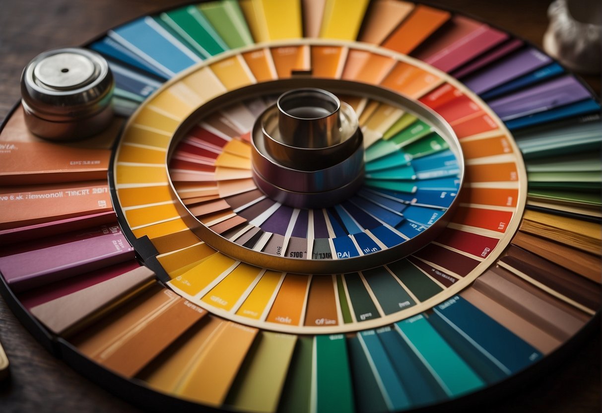
Delving into how color impacts viewers can elevate your art to new emotional heights. Let’s answer some common queries on the subject.
What are the psychological effects of color on human behavior in art?
Colors have the unique ability to influence emotions and behaviors. For instance, warm hues like red and orange can stimulate excitement, while cool tones like blue and green tend to calm the viewer.
How can artists invoke emotions in viewers through their use of color?
Through strategic color choices, artists can evoke specific emotional responses. A melancholic scene might use muted blues and grays, while a jubilant one could be filled with vibrant yellows and pinks.
What role does color theory play in the creation of emotionally charged artwork?
Color theory provides a framework for understanding how different hues interact, which is essential for artists looking to convey clear, impactful emotions in their work.
Can you describe some contemporary artists who effectively use color to express emotion?
Artists like Yayoi Kusama employ dazzling arrays of color to create immersive experiences. Meanwhile, Dan Scott’s use of lighting in “Elora With Christmas Lights” showcases emotional depth through color.
In what ways do color choices enable artists to communicate their message or story?
Color choices can symbolize themes, set the tone of a narrative, and highlight emotional undertones. This allows artists to communicate complex stories through visual elements alone.
How do specific colors or color schemes set the mood or atmosphere in a piece of art?
Specific colors carry intrinsic emotional weight. For example, a desaturated palette can convey somberness. Meanwhile, a vibrant palette may suggest a lively and energetic atmosphere.

