What is Tone in Art? Its Value and Effects
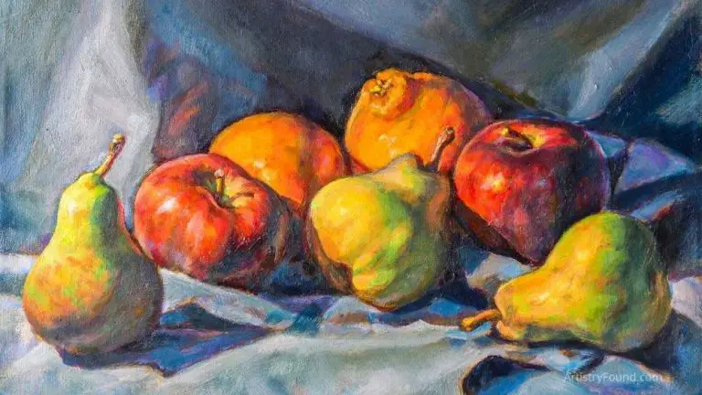
‘Tone’ is one of the basic elements of an art piece. In art, tone adds depth to a piece, as it defines just how dark or light something is. Simply put – changes in tone can turn a 2D painting or illustration into a 3D one.
It’s important to know the difference between color and tone! One color can have an almost infinite number of tones. However, we refer to those various tones with different names. For example, scarlet and maroon aren’t colors, but two tones of red.

(This article may contain affiliate links and I may earn a commission if you make a purchase)
Difference Between Tone and Color
These two tones, although very similar, aren’t the same, and they’re often mistaken for one another. People make this mistake because we have very little use for tone in everyday life.
We’ll take tomatoes as an everyday example. We all know that a tomato is ripe and ready to eat once it turns red. However, most of us don’t care just how red it is. Different tomatoes are different tones of red, but the color is still the same.
In real life – the difference between tones is very rarely important to us, which is why we mostly can’t appreciate it.
We Recognize Tone Through Comparison
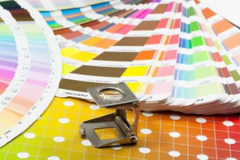
If you hold a ripe tomato in your hand and try to recognize the tone, chances are you won’t be able to tell whether it’s light or dark (unless it’s so light or so dark it’s painfully obvious).
However, if you hold two tomatoes one next to another, you’ll be able to immediately tell which one is darker (unless they’re so similar that it’s impossible to tell).
Now imagine that you’re holding a red tomato and a green apple. Could you be able to tell which one is darker and which one is lighter? They’re two different colors, certainly, but they’re different tones too.
You’d likely be unable to detect the tone difference between the apple and the tomato, even though there is one!
This is a simple experiment, but it teaches us that recognizing tone isn’t a natural occurrence for human beings! We can tell the difference between tones of the same color, but we can’t tell the tone differences between different colors.
We also can’t tell what the tone of an object is unless we can compare it to another of the same color.
Recognizing Tone Needs to Be Learned
Another reason we can’t notice tone consciously is because we do it so quickly that we don’t even realize it. In many instances, we spot it, but our minds process it so fast that we don’t actually understand what’s happening.
If you’re walking down a lit-up street at night, your shadow will move from one light to another. As you move away from light, your shadow will become paler, fading out. It’s not changing color – it’s just changing tone.
Introducing that to the context of art is no different. Artists need to learn how to recognize the tone of a color. Mastering tone is taught at art schools, and it’s not something that comes naturally.
Colors without tones are handicapped – an artist can’t express a realistic sight with just a single tone of a color.
Both the sky and the sea are blue, but if someone painted them with the same tone of blue, it’d be clear that they had no idea what they were doing.
How to Create Tone in Art

Photo: Unsplash
Even though artists can buy sets of a single color in many different shades, artists traditionally create tone by mixing two colors together. Dosing the colors precisely to create the perfect tone can be difficult, but the results are well worth it.
The best example of this is, once again, the color blue. Combining it with white will give you light blue – the color of the sky.
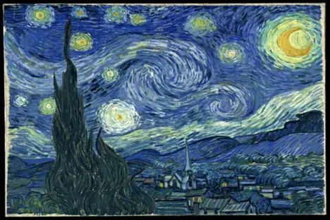
Combining it with black will give you dark blue – the color of the night sky. Starry Night (see image further below) is a great example – there are a few tones of blue in the night sky. The darker tone is the actual sky, while the lighter-toned parts are the clouds.
Another example, pencil art, is a bit more difficult as you need pencils of different tones (but the same color) to achieve a 3-D perception, unlike with tempera.
Digital art made this very easy as you can just choose a tone preset.
How is Tone Used in Art
Artists first started using tone in the nineteenth century. During that era, they began to paint landscape paintings in nature. In their efforts, they realized that copying the many different natural tones added a more realistic feel to their work!
If you think about it, not all trees are the same shade of green. Even though most tree leaves are green, there are thousands upon thousands of shades of green. In fact, the human eye is much more sensitive to green than to any other color.
This is an evolutionary side effect – we’ve evolved to be awake during the day and spend our time in nature, and sleep during the night.
Since nature is full of the color green you can naturally tell more shades of green than any other color.
Because of this, artists have to use different tones of green when painting different types of shrubs, trees, grass patches, etc.
After including tone in more and more pieces – the nineteenth-century generation of artists realized that their art pieces were simply better. They had a certain depth to them, and they were much more realistic.
Fast-forward to the 21st century, we now know three major uses of tone in art:
1. Creating depth, form, and distance (important for developing a 3D effect)
2. Contrasting dark with light
3. Establishing an atmosphere
Creating Depth, Form, and Distance Using Different Tones
An artist can establish depth through the use of tone by shading. We perceive depth through light – parts of an object’s body in the shade will be darker, and those in light will be lighter.
By painting it this way, the artist is establishing a natural depth. The most obvious example is a portrait. The part of the face between the eyes and the nose is usually shaded on one side.
This is because in real life, you’re usually being struck by light from a single side – either left or right. Because of your natural nose bridge, one of your eyes is in the shade, while the other is mostly alight.
Now imagine that an artist paints a portrait with no shading – that face would have no depth. It would just be a 2D attempt at a realistic portrait.
When it comes to form, an artist can use the sudden contrast of two tones to form a line. This also helps create the illusion of distance, as we perceive darker objects to be further away and lighter ones to be closer.
Contrasting Dark With Light Using Tone
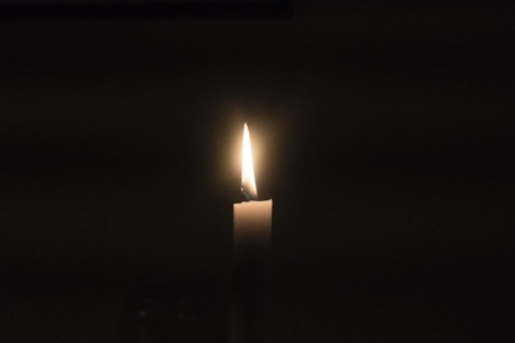
Photo: Unsplash
We’ll later learn about the three types of tone in art, but for now, let’s focus on how to use them. Contrasting dark tones with light tones will establish perspective.
Lighter tones are usually used within the part of the painting that’s alight. This is what the artist wants to draw attention to (for example, a face). Darker tones are usually background tones – something that the artist doesn’t want you, the viewer, to notice as much.
There should be a tonal compromise and a gradual change between darker and lighter tones.
Establishing An Atmosphere
Simply put, we naturally subscribe meanings to colors. For example, we relate dark colors to pain, fear, loneliness, and horror. On the other hand, lighter colors are related to happiness and the feeling of fulfillment.
Depending on the tone, any color can establish any type of atmosphere.
What Are The Types of Tone in Art?

Even though there’s an almost infinite number of tones for every color on the spectrum – there are only three types of tone.
Using the color red as an example: there are light, dark, and mid-tones. A light tone of red is rose. We then have apple as a mid-tone and currant as a dark tone.
These three types of tone can be expanded into a more detailed table. Denman Ross developed the value scale for tone. The same scale applies to every color.
The standard tone value scale has nine degrees (nine tones). Ranging from the lightest to the darkest, they are as follows: white, high light, light, low light, mid-value, high dark, dark, low dark, and black.
We also have to mention the terms ‘global tone’ and ‘local tone.’ The global tone of an art piece is the general tone of the entire piece, while the local tone is the tone of a small area of the picture or a specific object.
For example, if we take a look at Van Gogh’s Starry Night painting below, we’ll notice that the global tone is dark (to no one’s surprise – it’s a nighttime landscape painting). The upper right area, though, is of a light tone.
Flickr Image by Christopher Penn (Resized)
That’s because it’s showing the moon. You can also notice that the sky is mid-tone; this is an effective way to show that moonlight dissipates as it travels to the ground. That’s why the town itself is darker than the sky above it!
Tone and Contrast in Art
Contrast can be used in hundreds of different ways, and it doesn’t have to be achieved by opposing two colors. Instead, you can oppose two tones of the same color. Dark (wine) red next to light red will create a massive lined contrast.
A good example of this is The Girl With a Pearl Earring by Johannes Vermeer. If you take a look at the bandana on her head, you’ll see that it’s blue – two tones of blue, to be exact.
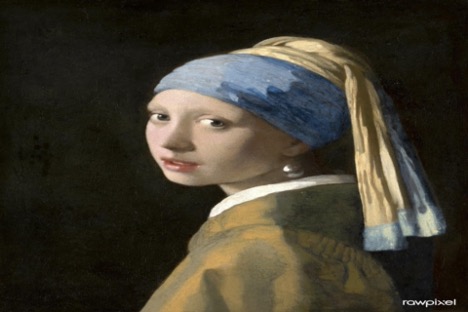
One is light, and the other is particularly dark – achieving contrast. The contrast and the positioning of these two tones establish the illusion of lighting.
It seems as though there’s a light in the top left corner of the painting – shining on the girl in the portrait. The toning of her clothes achieves the same effect.
The clothes she’s wearing are a characteristic mustard yellow. This mustard yellow is broken into two tones – a dark and a light tone. Contrasting, these two tones of the same color establish the same effect the blue contrast does.
We’ve already mentioned contrast when creating form – two contrasting colors can develop a line. This way, the artist can make a line without actually drawing it.
However, this effect is negated by shading the colors and using mid-tone. Gradually moving from a very light to a very dark tone of color won’t create a form. This is why contrast and toning are so intertwined.
Tone and Emotion in Art
Tone can be used to play with the emotions and reactions of the viewer. For example – light red is a delightful color to the human eye, just like light blue.
However, dark red is a very aggressive, attention-drawing color. Artists can use tones in this manner to spark a certain emotion in you.
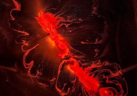
Photo: RawPixel
Since red is associated with aggression and elicits a compelling response, using very little dark red on a neutral background will draw your attention to it. The most practical example of this is flashing police lights.
They’re red for a reason – red is one of the most difficult colors to ignore, especially if it’s a solid, dark red in the middle of a light-red area.
An example of this is Les Courant De Tes Reves by Katia Poulin. No matter how small it is, the small blood-red circle on top of a black background draws negative attention to it.
To the right, you have a yellow portion with different tones of yellow. To the left, there’s a blue portion with varying tones of blue. Together, these two-toned portions establish a balance.
That balance is disturbed by the red circle in the middle.
What is Tone in Art – Conclusion
Tone is used to create light and dark contrast within an artwork, generating a sense of antagonism and tension between distinct aspects or highlighting certain areas of the composition. Once you master the ability to identify tones correctly, you can play with everything ranging from bright whites to deep blacks.
When starting out, you can use the help of visual aids such as a black and white value scale to predict tonal values. These methods continue to serve as inspiration for modern art and produce spectacular results.

